Thursday, March 7, 2013

Lab 7


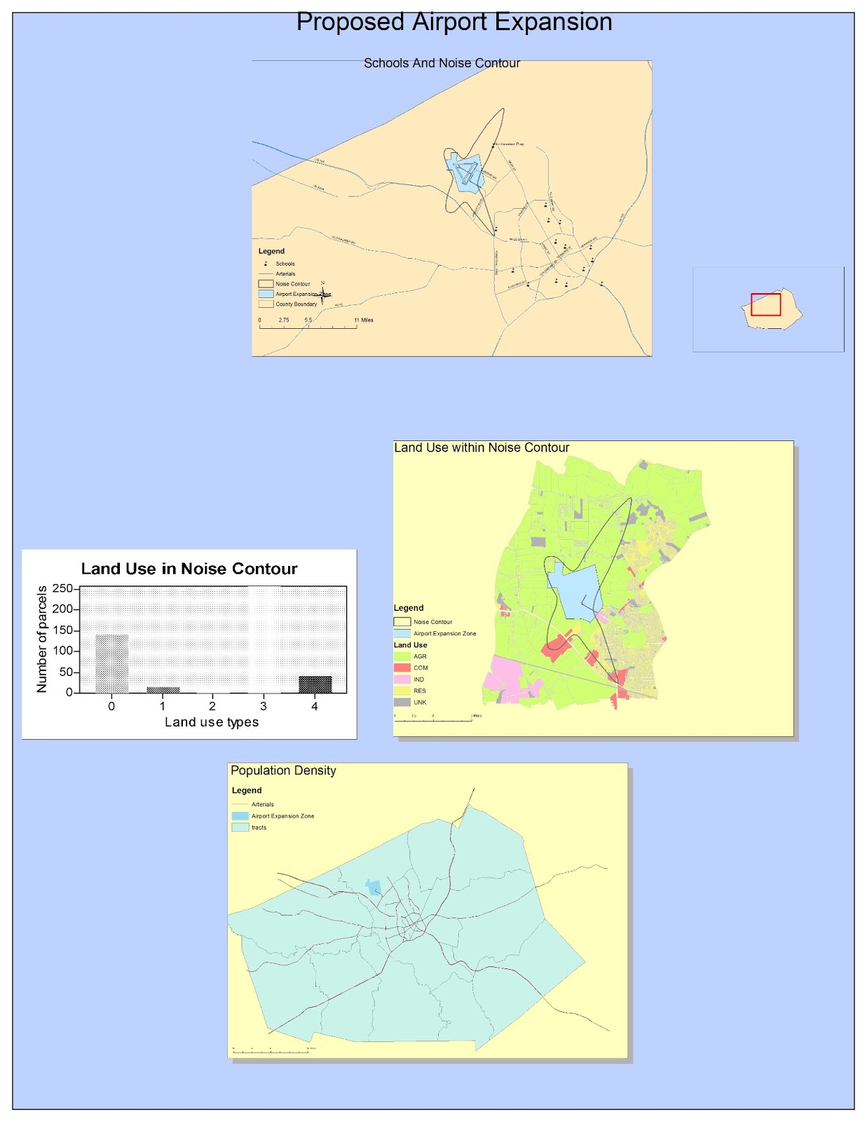
The first picture shows the population in percentage of Asian spread across the continental United States. Clearly, in the map, the density of Asian population is much higher in the west coast and the east coast than in the middle. Because of the history, Asian people were brought to America as workers focusing on mine jobs, railroad builders. With the reason that Asian came to United States by sea and first located at the coast, most of them would stayed at coast forming Chinatowns or Kreantowns. Los Angeles, New York, and other cities along the coast had lots of work opportunities, especially, the gold mine in San Francisco, giving Asian worker a place to seattle. Even though many Asian population spread across the entire continent, many still remain at coast, leading the high Asian population percentage in the southwest and northeast coast.

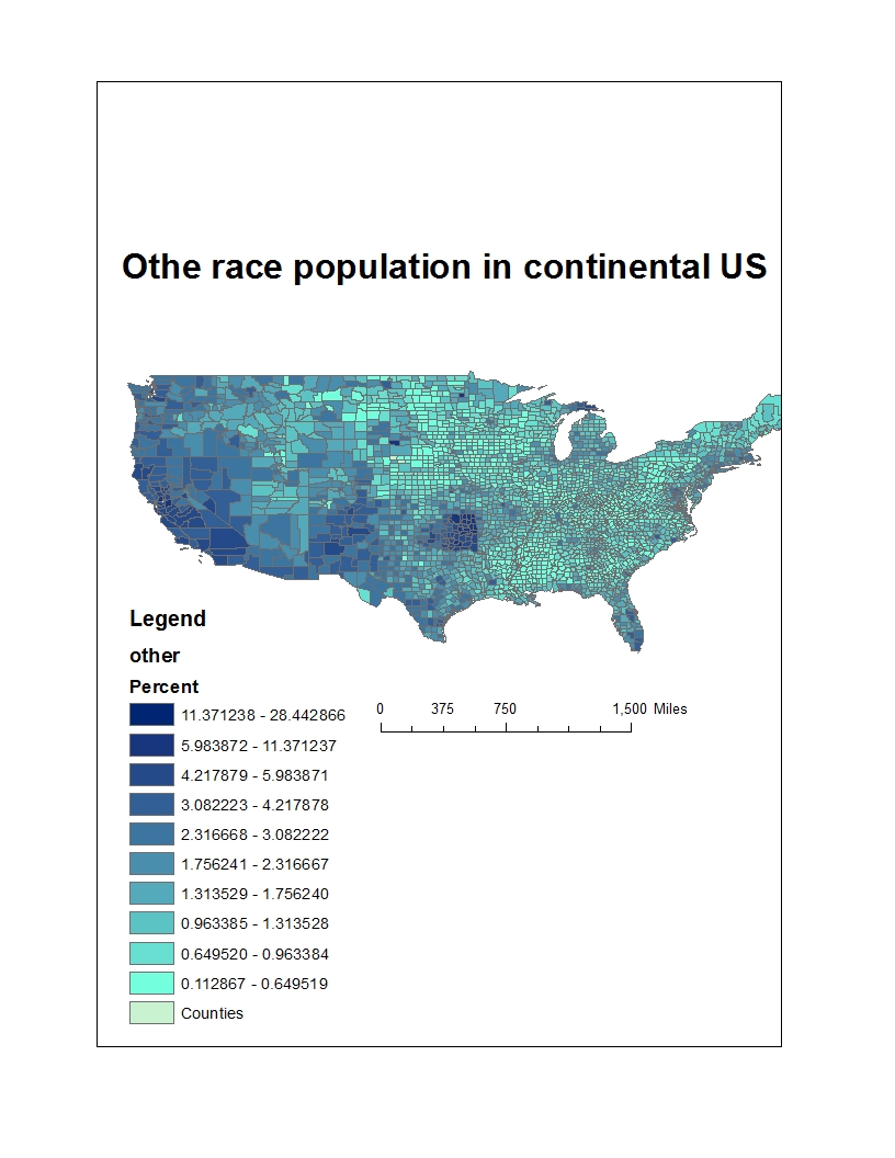
The second picture gives an image of the population percentage of other race, which is not labeled as "White", "Black", "Asian", "American Native and Alaska Native", and "Native Hawaiian ans other Pacific Islander". It is shown that most of them lives at the southwest and west of the continental United States. The other races are mainly the Hispanic population immigrated from central America. As we can see in the map, California, New Mexico are the major states for Hispanic population because of the short distance connected with Mexico. Moreover, on the other side of the map, Florida, we can see a little darkness along the shore. The other races in Florida are mainly people immigrated from Cuba for the same reason Mexicans came to the southwest. The short distance connected with their home country is the reason that high density of other race population in the southwest and Florida.

The last map, namely the Black population distribution in the continental United States, has the distribution of the population more concentrated. As we can see, more than half of the population in the southwest is African-Americans. Large population of African-Americans in the southwest is the result of the slavery history.  Most of the Africans were shipped to the southwest of US for the large number of labor needed in the slavery age. After the slavery, most people brought to United States still chose to stayed at the southwest.  Compare to the Asian and other race population density, the Black population is more concentrated.

In this lab, knowing the distribution of Asian, Black, and other race population is just part the of result. Moreover, a better understanding of the use of the GIS is gained during the process. I have learned the combination of the country and the census. The color option is very useful to show the difference between the population, which gives people a direct image of how the distribution is. Furthermore, with this lab, more applications of GIS is discovered, the join of implement data, arithmetic of the data, and the convertor of GIS helps me knowing a lot more of how to making a better map.


Thursday, February 28, 2013

Lab 6

Geographical  Coordiante System:
GCS_North_America_1983

Extent (in degrees):
Top: 34.236
Left: -120.368
Right: -119.503
Bottom: 34.871


The DEM above gives a small portion of the Santa Barbara bay area in Southern California. The reason for me to choose this specific area for this lab is that the rise and fall in this area with the comparison of the land and sea. Either in the aspect and slope perspective, it is clear to distinguish the sea. In the aspect, we can see the elevation in this area. Also, in the third picture, only a small area shows high slope in this area. Moreover, the with a little higher range, the elevation is clear even though it does not look real.

Thursday, February 21, 2013

Lab 5


Distance from Washington D.C. to KaBul
Mecator: 10112 miles
Stereographic: 9878
Distance from Washington D.C. to KaBul
Two Point Equidistant: 8341
Azimuthal Equidistant: 6648

Distance from Washington D.C. to KaBul
Bonne: 8329
Hammer_Aitoff: 6731

The six different maps above are six map projections containing different attributes. Map projection is a transformation that gives the 3-D world a flat face, which we can see in the maps above. Map projection can only hold certain different attributes for different use of a map. There are three preserved properties map projection, conformal, equidistant, and equal area. For different reasons of using a map, the properties that fit the requirement will be different leading to choose different type of projections. Conformal map projections preserved the local angles and shapes. Equidistant preserved the distance from a point to the center of Earth. Equal area preserved the proportional area on Earth. The maps above are distinguished by the different preserved properties each one has, not the types they are. Besides the preserved properties, map projection has three types, cylinder, plane, and cone.

The first two maps in the first picture are conformal, which means that the map have the same shape as the real world. As we can see in the Mecator map, each continent is the shape of the real world. On the other hand, the distortion is clearly shown in the map. The longitude is straight up near the north and south pole. However, as we know that the longitude should be come together as we close to the poles. It is more accurate near the equator than in the poles. As in the Stereographic map, the area of China is almost as big as Russia. Because of the distortion in the map, the distance from Washington D.C. to Kabul should have a difference between in the map and in the real world. The distance in the Mecator map, 10112 miles, and in the Stereographic, 9787 miles, comparing to the real distance, 6940 miles, has a significant difference.

The two maps in the middle are equidistant maps. The equidistant map does not mean that proportional the distance in the map is equal to the distance on ground. The equidistant means that the length for some particular reference points are preserved. The Two Point Equidistant map preserves the distance from any point on the map to two chose point. With different "control point" or the point people choose, the distance may be different. On the other hand, the distortion in the map is clear. The area of the Antarctica is obviously smaller. The Azimuthal equidistant map preserved the distance along the great circles radiating from the center. We can see how the continent shifted together with the distortion.    The difference between the real distance and  the distance on the map is not as large as the Conformal, giving more accuracy on the distance.

The last two maps are equal area. Equal area map projections preserved the proportional area of the ground. As we can see from the map, the large distortion of length and angles gives lots of errors of calculating the distance from Washington D.C. to Kabul. The other map has even more distortion. The heart-shape map changes the distance from one places to the other and the angles are clearly not preserved. With the distortions, the distance from Washington D.C. to Kabul may vary from one to the other. The six maps above show different preservation of certain property and the distortion of the maps, showing the importance of choosing the corresponding map for certain use.

Thursday, February 14, 2013

Lab 4 (ArcMap)


The map I created above is the result of using the software ArcMap, which I believe is a great program for professionals. However, several pitfalls occurred during the time I was using. First of all, the connection with the file is pretty frustrating for me. I have never come across this kind of user-unfriendly software. The users have to connect the file on the computer themselves. It took me a long time to figure out how to connect to the file in my USB drive, which for me was not a happy experience. Moreover, it is a very complex software. Even though I had the tutorial with me, which is very long, it still took me a long time to finish the project. The ArcMap really is not a program for non-experts, who can use the Neogeography the user-friendly software. It took a lot time to learn the basic command to create a map. I cannot image how long it will take to good at it.

Despite the pitfalls of the program, the ArcMap really is a powerful tool to make a professional map. With its complexity, the software can do a lot of comparison, distinction, and other functions. After several hours of working with the tutorial, the map looks quite nice for me. However, I believe that what I know is just a small part of the functions in the program. The tool bars in the program is very useful and concentrating on creating a map, adding a legend or north arrow or scale bar is very easy with lots of properties user can change. Also, the layout view and data view are very functional.  I can view the map with different view to decide what I want the map to be. Moreover, when working with details, data view gave me a clear view if the detailed data so that it is easy to make a change. Finally, in the end of creating a map, exporting the map was very efficiency with many different types of outputs I can choose.

The ArcMap is a powerful software for making a map. Even though, the pitfalls may give people some awful impression, it is very useful for professionals. With all the potentials, creating map focusing different research would be more efficient and precise. The project on ArcMap was a unforgettable experience, I really hope to get to know ArcMap more along the class.

Thursday, January 31, 2013

Lab3


View google map (Lab3) in a larger map


The map I created is about the tour that I am going to have with my parents. It is a ten-days tour in the west. The tour covers several cities with different view of natural. The desert and the ocean will be the main focus in the sightseeing. I believe that the tour I will bring to my parents will be a fantastic trip.

Neogeography is an application that gives people a simple and fast tool of creating their own maps. The new technology that uses in neogeography is more concentrating on the interaction with people. People without any knowledge of creating a map could use the neogeography to share their lives in a map to their friends. Since the neogeography is a web-based technology, the information exchange using neogeography is world wide, which will give people a chance to see different life-style of other countries. Moreover, The geological and spatial information exchange becomes easier. Lots of spatial-based ideas will appear on the Internet, which gives professionals easy access. Volunteered spatial information will be online with detailed information.

Neogeography has many benefits not just for non-experts. On the other hand, for professionals  there still exists some pitfalls of using the technology. Free access means that the information is not reliable. False data may occurred since the data is from non-experts and volunteers. As a result, the information online may be confused for non-professionals, which information trustable? Also, for professionals, even though they have the sense of  distinguishing false data, but it still will take a lot of time for them, which would decreasing the efficiency for them.

Neogeography is a new technology for people to make their own maps, which will have both benefits and pitfalls. However, with a sense of suspecting data from the Internet, people who do not know about GIS or other professional application still can use to make their life simpler.

Thursday, January 24, 2013

Lab 2

1.  The name of the quadrangle is Beverly Hills Quadrangle.

2. The names of the adjacent quadrangles are Canoga Park, Van Nuys, Burbank, Topanga, Hollywood, Venice, and Inglewod.

3. The quadrangle was first created at the year of 1966.

4. Selected hydrographic data from NOS/NOAA chart 18744(1964), North A,erican Datum of 1927 (NAD 27), and North American Datum of 1983 (NAD 83) are used to create the map.

5. The scale of the map is 1:24 000

6.
  a) 5 centimeters on the map is equivalent 1200 meters. (5*24000/100)
  b) 5 inches on the map is equivalent approximately 1.89393939394 miles. (5*24000/(12*5280))
  c) one mile on the ground is equivalent to 2.64 inches. (1*12*5280/24000)
  d) three kilometers on the ground is equivalent to 12.5 centimeters. (3*1000*100/24000)

7. The contour interval is 20 feet.

8.
a) the Public Affairs Building: 34°4'30''N, 118°26'20''W; 34.0750°N, 118.4389°W
b) the tip of Santa Monica pier: 34°25"N, 118°30'E; 34.007°N, 118.5°E
c) the Upper Franklin Canyon Reservoir: 34°4'46"N, 118°24'45"; 34.0794°N, 118.4125°

9.
a) Greystone Mansion (in Greystone Park); 570 feet, 173.736 meters
b) Woodlawn Cemetery; 140 feet, 42.672 meters
c) Crestwood Hills Park; 800 feet, 243.84 meters

10. UTM 11

11. 3763N, 361.5E

12. 1,000,000 meters2

13.


14. +14°

15. Water flows southward.

16.


Wednesday, January 16, 2013

Three maps (GEOG 7 Lab 1)


Reference Map of California

The map is based on a state map of The National Atlas of the USA.
 URL: http://www.nationsonline.org/oneworld/map/USA/california_map.htm.

This is a reference map of transportation routes in California. The map gives us a scene of the major transportation lines in California. The places with high density of transportation lines are major cities. Los Angeles is the biggest city in California, which has the most concentrated lines in the entire map. On the other hand, the mountain area only have several principal highways, showing how hard it is to build a road on the mountains. The map is interesting for me because I like California even though I am not from here. A few years back, I was an exchanged student to the Northern area of California. It was a fantastic experience with the people and that is the time when I started to like California. After couple years living here, I have explored more about California for the easy accessibility of transportation routes.
Large Map of China


Map of China
http://www.mapsofworld.com/china/map-of-china-large.html

This is the map of China. The map shows all the provinces in China with their capitals. With different colors for different provinces, we can easily distinguish the area of the provinces. It easy to see the major cities like Beijing, Hong Kong, and shanghai. I choose this map because this is the country I come from. I'm from the city called Zhengzhou, which is in Henan province, located in the middle of China. The map gives people who do not know very much a vivid image of China. When they see this map, they would look for the major cities they know and get a rough idea of the locations of those cities. Since this is just a political map that only shows the distribution of the provinces, there is not much other information about the topographic features.


World Map of Social Networks
URL: http://www.hejorama.com/articles/the-monday-map-infographic-maps-10214/

This map shows what is the most popular social networks in different regions.Without the white area which is the region collectors do not have the data, blue makes most of the region. It is not surprise since Facebook is the most popular social network around the world. If Facebook is not blocked from China, China would have at least half to be blue. For China, it is the Qzone which dominates the market of the social networks, while another company, the Renren Inc., wants to the share the market. Also, for Russia and several other countries, many different social networks are the major players in those countries. It is interesting that this map vividly gives me a global image of the major social networks and countries they cover. As we can see, Facebook covers majority of the English speaking country since Facebook is more adaptable for people from Western country.